My name is Sheryl Williams and I am an Alcohol Ink Artist from Delta, Colorado.
Please visit the new site at https://sherylwilliamsart.com
My name is Sheryl Williams and I am an Alcohol Ink Artist from Delta, Colorado.
Please visit the new site at https://sherylwilliamsart.com
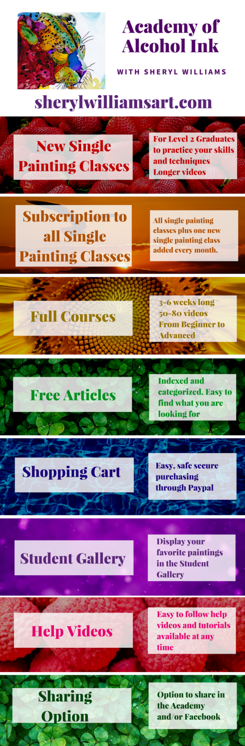
I am so excited to let you know that eight months of work to create a better website for you to meet your Alcohol Ink needs is almost finished. Here are the features you will find at the Academy of Alcohol Ink:
You can decide if you would like to stay at the williamsart.gnomio.com site or switch to the new site.
There is a list of help videos for you to watch including:
Opportunity – those of you that would like to take the Water class – take it for $60 until December 15th. After that date it is split into two classes: Reflections and Rivers (1) and Oceans, Waves, Foam and Sunsets (2) After December 15th you can purchase each class for $50 or the two classes for $90.
New students will begin classes on the new site once we go live – End of November.
I am hoping to move you over to the new site but if I can’t there will be a place to subscribe on the new site to keep getting your blog posts and updates.
The new site will have the same address: sherylwilliamsart.com Once the switch is made you will see the new site without doing anything.
In the first part of this post we looked at five different directions of light. In the second part we examined how a change in light direction can improve the image. In this part we look at ways to determine how to figure out the light source in a reference photo. Just a note: this attention to light will improve your paintings as well as help you select the best reference photo you can find.
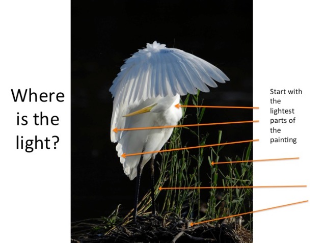
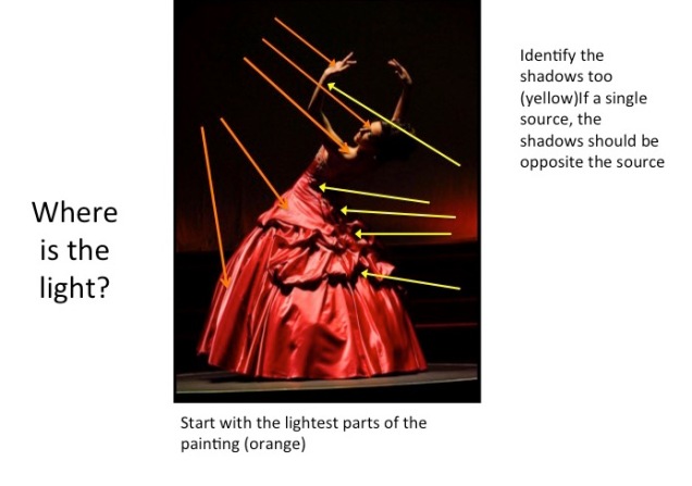
We need a method to determine the light direction in our reference photo. Let’s look at several photographs and determine the light source.
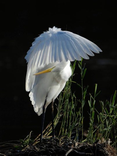
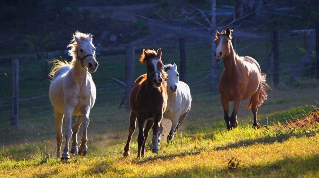
This photograph has beautiful interesting light.
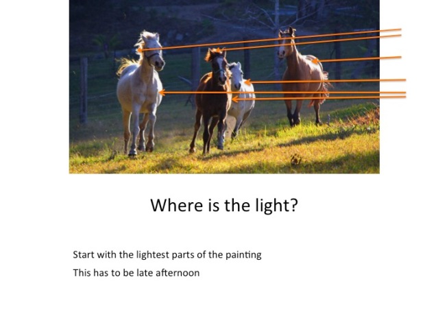
Find the spots in the painting with the most light. See if you can figure out where the light source is that is causing these lightest places. (orange lines). You can draw on a copy of the photo.
Next look at the shadows from the darkest to the lightest. If there is a single source of light the shadows will be opposite the lightest places. Find the darkest shadows.
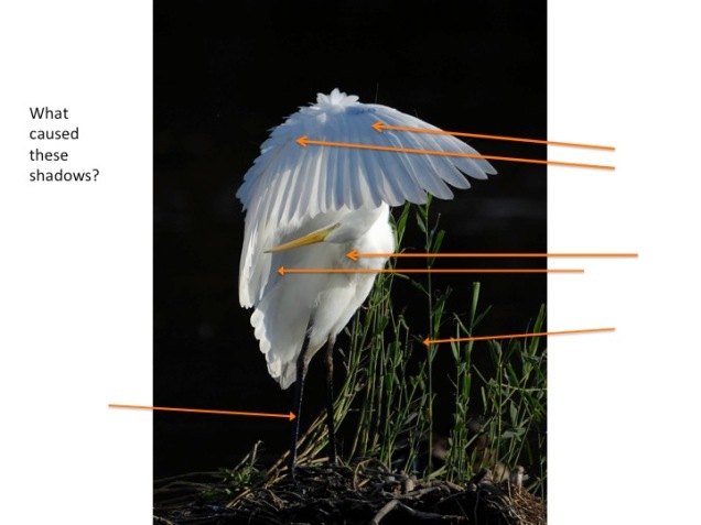
In this photograph the light is from the right and below the feathers that are raised. There is a bit of backlighting for the forward upper feathers creating a very excitingly lit photograph.
If the photograph has changed the lighting to come from multiple directions you’ll find that out and then decide if that is the photo that you want to paint.
Look at the light and the shadows.

In my opinion this painting would look better with out the bag/purse because it has soon much light that it steals the focus from the shiny shoes.
I hope these examples have helped you observe, discover, and apply light in your paintings.
This is an except from Art Fundamentals at the Academy of Alcohol Ink (Online) coming soon at sherylwilliamsart.com
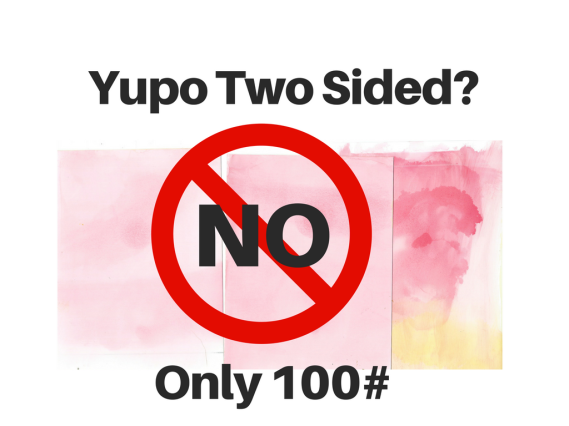
Sandy Sandy of the Yupo Group asked her friends a Legion Paper – the Distributors of Yupo Paper if there were two sides. Here’s her comment “According to the Yupo mill, there is not a difference in sides, unless you were using the 100# cover or Yupo Blue . . . “According to the mill, the only YUPO paper that has two sides, based on how it’s manufactured, is the 100lb Cover.
Keep in mind, the YUPO technical team has no experience whatsoever with art applications and YUPO. They reviewed the video and do not know what is happening or why. The information they supply to (offset) printers does not include anything about varying print results on either side. In fact, their customers print on both sides all the time – with the same results.
This explains why I saw a difference at Carol Ann’s house but couldn’t replicate it on my own. Carol Ann said she was using 100# paper. I was using 74# and Sandy said that “I have never even seen 100# retail . . . It is usually 74# or 144#”. Carol Ann has been using Alcohol Ink for 7 years and is a distributor for Ranger products and may have access to 100# paper.
A least we got to see what mineral paper looks like and how it acts. On to the next curiosity..
I went to a terrific Alcohol Ink Workshop with Carol Ann Rasmussen. She was so generous with her knowledge. I appreciate her so much. Anyway, one of the things she demonstrated for us was to show us that Yupo has two sides – a smooth side and one with a bit of fuzziness. At her house it seemed pretty apparent that there was a difference. On one side the inks and blending solution moved a lot and on the other side, not as much. There was a distinct difference in the staining as well.
So I decided to video my experiment to see if I could replicate the difference in the two sides of the Yupo Paper. At the end I decided to also do the same experiment on Yatsutomo Mineral Paper just to see the difference.
Yupo Paper 2 Sides from Sheryl Williams on Vimeo.
I would love for you to do the same experiment and see if you can see a difference. If so, will it change your planning for your paintings?
Here’s a neat video on the Mineral Paper. It is less expensive than Yupo and many people are trying it out:
This is part 2 of 3 in a series about selecting the best reference photos you can based on the light. If you have not yet read Part 1, click here to read it first.
Let’s find better Photographs.
In Part 1 we looked at five different directions of light:
The first two directions create lovely photos, fit for painting. The last three are not as attractive. In this part we are going to use the example photos from Part 1 and find optional photos with the same subject but better lighting.
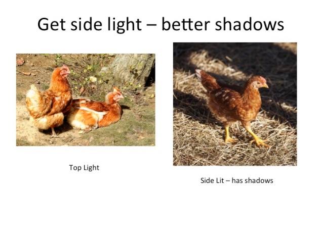
By selecting a photograph with side lighting it is easier to see the details in the chicken because the shadows add depth and definition.
Look at the three options for a better sunflower reference photo: two from the side and one backlit.
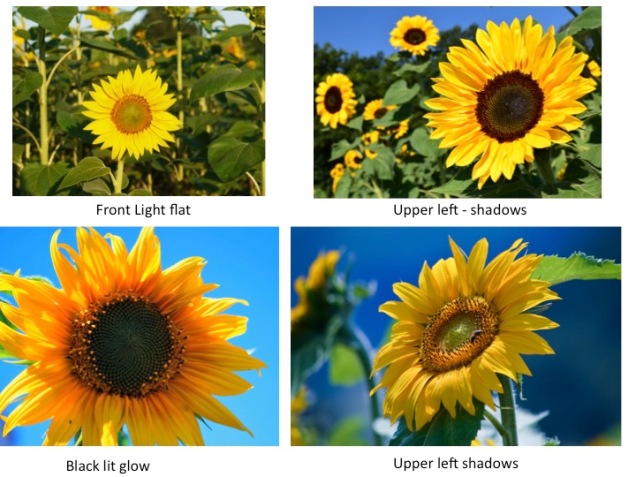
The shadows cast in those lit from the sides let us feel like we could touch the sunflowers. The one that is backlit is just interesting and pretty and there are some shadows tool.
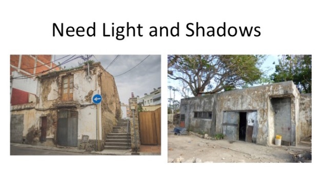
This isn’t a very exciting photo but by selecting one with some light and shadows it’s improved. You can feel the shape of the building because the shadows show you.
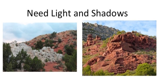
Look how much more interesting this picture of the rocks is with the light and shadows. I love this example because this looks like where I live. The shadows give you so much depth and the colors are much more vibrant in the second picture.
My advice is that when you are looking at reference photos, even if they’re by your best friend, look at the direction of the light and find the one with the best lighting to paint.
What makes a painting or a photograph exciting and realistic — the light.
In order for a painting to look realistic there must be light and shadows so we move from 2D to 3D. In order to pick a good reference photo with the best light possible we need to understand where the source of the light is. If you put together a composite picture, you need to be sure that the light source is the same in all of the components or it won’t look right.
The issue I find most problematic is selecting a good reference photo with the best light possible. We look at examples to understand where the light is in a photograph.
“One of the most crucial aspects” to get a” painting to look authentic or realistic is to have the direction of the light consistent across all the elements in a painting. When you’re still at composition stage, you need to decide which direction the light is going to come from as this influences the shadows, contrasts, and colors.”1
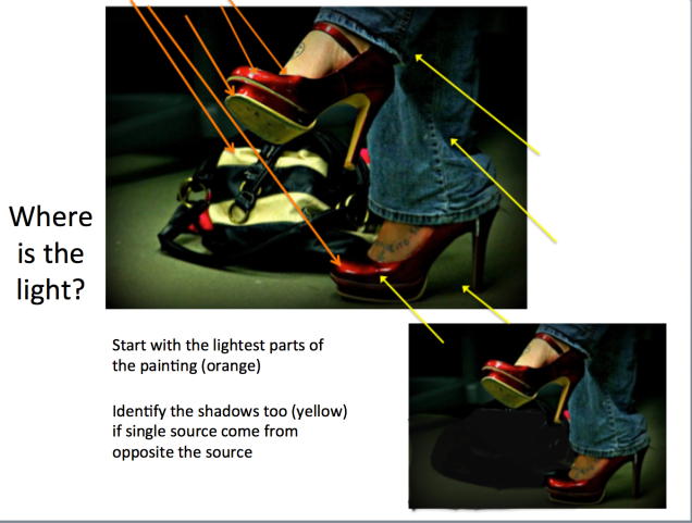
Look at these images:
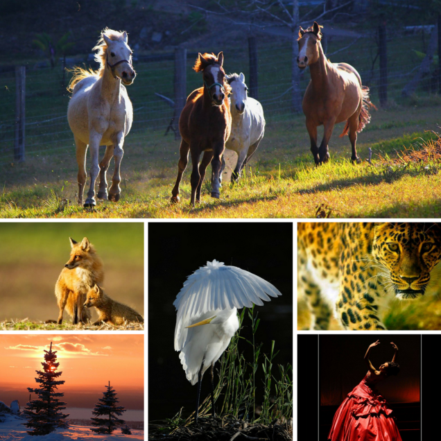
What makes them interesting is that the light source is clear and distinct and easy to find and the shadows created are deep and dramatic.
Let’s examine some pictures to learn more about light direction.
Let us look at five different directions of light:
We are going to save reflected light for another lesson.
Look at these images:
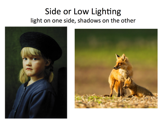
With Side or Low Lighting the source of the light is on one side. This is a style used by the Renaissance masters. The light is bright and the shadows are long on the opposite side of the light.
I love this light and if you are outside it’s the shots in the early morning or late in the day. Often the color of the light is different than it is in midday. * (all images are from Pixabay)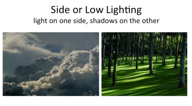
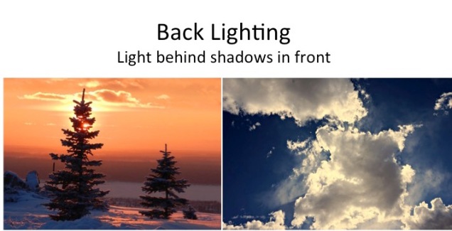 Back Lighting is beautiful too and harder to achieve. The shadows are right in front of the viewer and a bit of the light sneaks around objects into view.
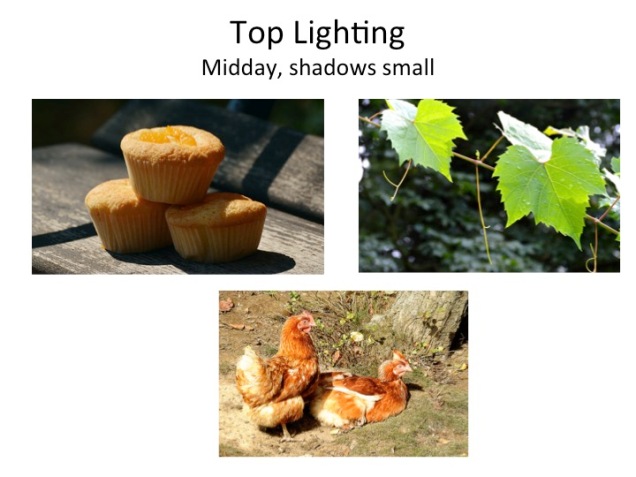
With the light directly overhead there are not many shadows. The chickens in the lower picture are very flat. The muffins have shadows but they are casting their own.
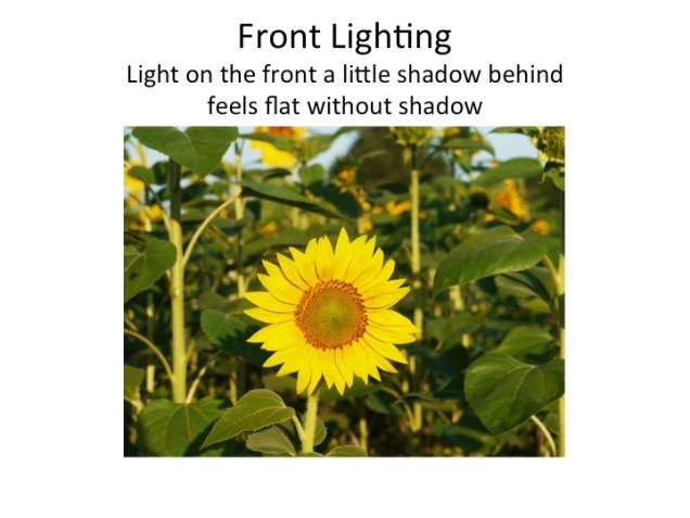
Here the photographer is right in front of the sunflower and there are no shadows.

These pictures are dull because there really isn’t any distinct light source or shadows. I see a lot of paintings using overcast reference pictures and they could be so much better if they picked a picture with some light. Family photos, pets, landscapes from trips often fall into this category. If you have to use one of these then make up your own light an apply it evenly in your painting.
So many students remark that they don’t know how to draw and are really intimidated by it. I was recently at a show where the judge remarked that only 3 out of 10 artists know how to draw. So what do we do? Certainly, you can learn how to draw but there is a lot of value in tracing your image so you can create without being paralyzed by the fear of drawing.
What are the benefits of tracing?
Here’s a great video by Lisa at Lachri Fine Art.
Lisa also mentions that if you trace the same image repeatedly you will improve where as if you free hand repeatedly you’ll probably make the same mistakes.
There are different methods to transfer your image to paper and it’s a common practice especially for realistic painting. I use carbon paper between my black and white photograph and my yupo paper. I use a black and white photo so I am forced to focus on values rather than colors or hues. As I find values (lights and darks) critical in my paintings I appreciate every opportunity to observe them in my reference photo.
In this video by Lisa at Lachri, she uses transfer paper between tracing paper and her surface. This video is using acrylics with a background put down first and then white transfer paper so it can be seen.
When we get into the pets and water classes there is a lot of detail in the subjects. I get the question “How much tracing is enough?” You need to decide this for yourself. Often I will trace with a great deal of detail and then find when it’s time for the painting that I don’t need it. That’s okay because I’ve been observing my reference photo.
You can see in Lisa’s video using the transfer paper that she just has the major shapes traced. The rest of the shading and color selection is done while she is painting. For many people this is just fine. For fur and feathers it’s probably more important to select the areas based on value and not need to trace every line of fur or feathers. It’s fine to add some clues which direction the fur or feathers lay to remind you, but there’s no need to put in everything.
Let’s look at a couple of coloring book examples – one for children and one for adults


How would you make a great painting out of the first one? If there was enough shading to make the fish look 3 dimensional and the colors were gorgeous, this would be enough.
What about the adult one? It appears that the line work acts to add values and give a 3 dimensional affect. If you are careful to get the lights and darks correct and use colors based on their values this could work too.
Some people will look at the adult drawing and feel “yipes! too much” and others will think it looks like a lot of fun.
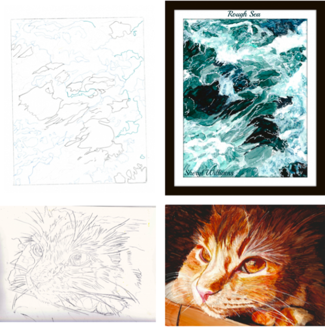
Here are a couple of my examples: foam in the ocean that has the major areas and a cat that has way too much tracing.
I’ve added the finished paintings too so you can see what happened between the tracing and the end painting.
It all depends on you and what works for you. I’d love to hear your comments.
 I’m so excited to be featured in the Chameleon Newsletter for this month with the Article and Video “Can You Use the Blender Pen for More Than Just Blending“
As you know I recommend the Chameleon Blender Pen as an essential tool in our classes. The folks at Chameleon found out about it and asked me to make a video explaining how it is used.
I hope you’ll get some new ideas too.

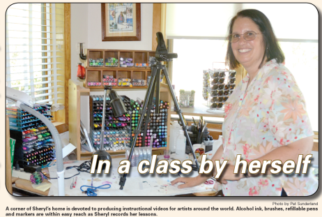
I was lucky enough to have an article written in our local newspaper about teaching Online Alcohol Ink classes. Click to read the article. Sheryl Williams Newspaper Article 7 16
Here’s Time Lapse #2 Sleepy Head based on a photograph from Aviya Glass at pmp-art.com This is for an upcoming class. Stay tuned.
Sleepy Head Time Lapse from Sheryl Williams on Vimeo.
